
Roles
Task
Goal
Time
UX Designer
Form Design
Decrease Errors with form data
January 2023
Roles
UX Designer
Task
Form Design
Goal
Decrease Errors with form data
Time
January 2023
Problem
The local Meals on Wheels organization needed to redesign their request for service form. The form could be submitted by the person the service was for or by a family member or friend. The form needed personal information and had to include an upload component so that the worker receiving the form could verify disability status. There also needs to be a way to select dates and times for the service.
Actions
Workflows
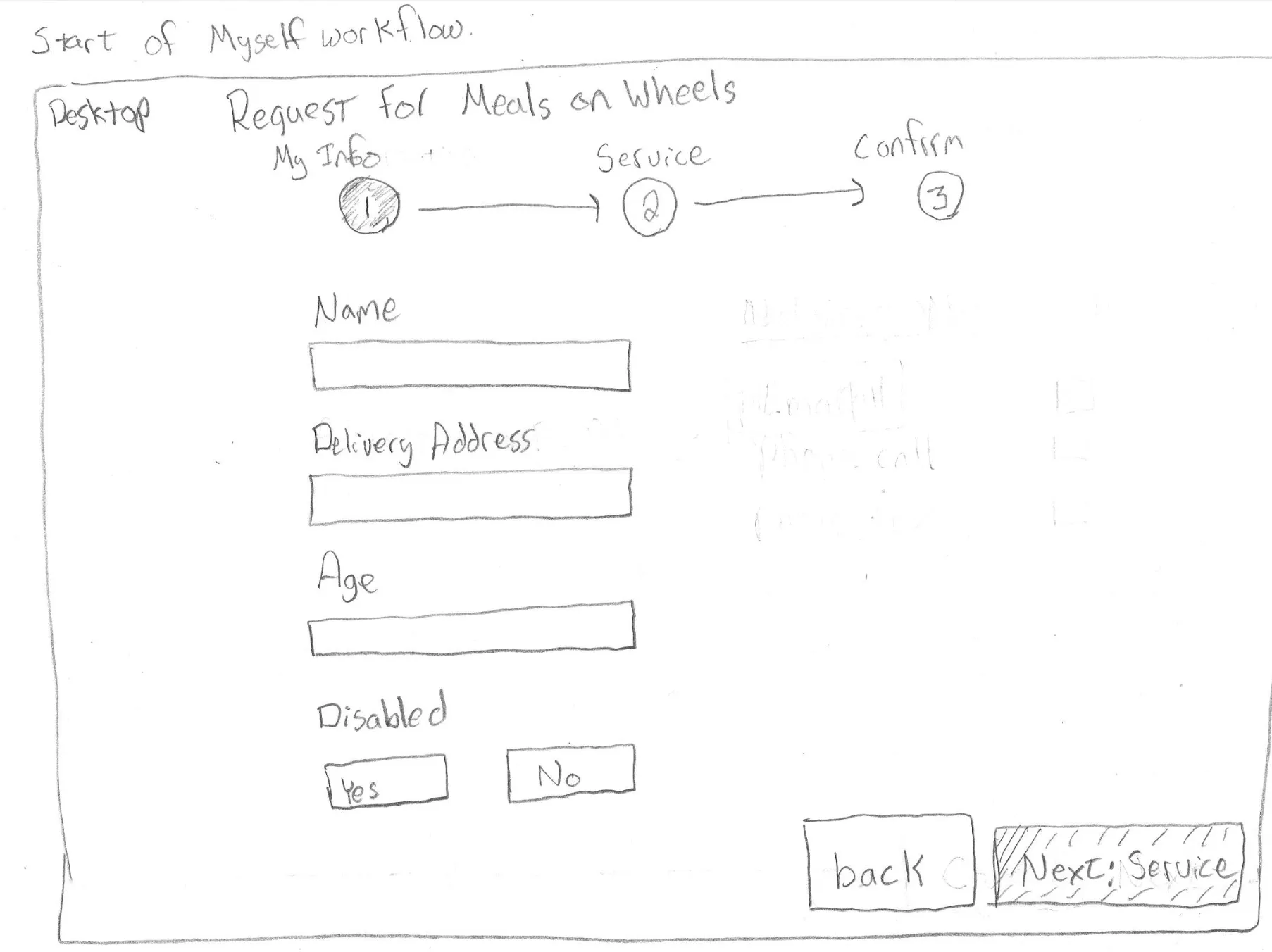
I first had to sketch out a few different workflows for users to navigate the form. It was essential to break up the form into related steps. I broke up the form into the following sections: My Info, Service, and then a confirmation screen. The form is a wizard with these sections as steps. The initial workflow started with a user having to select whether they were requesting service for themselves or someone else.
 |
|---|
| Wizard sketch after the user selects myself at the form enter screen |
Sketches
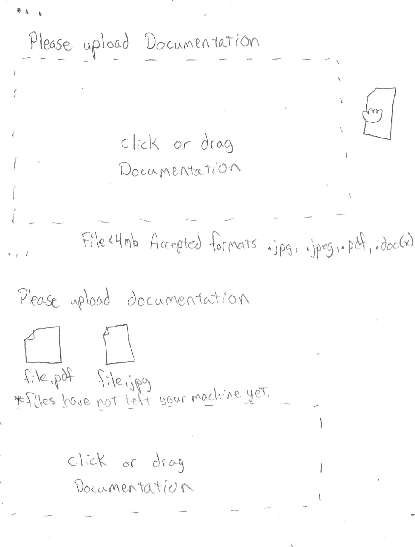
I sketched out all of the workflows for the wizard. Additionally, I added attributes for the form inputs. For example, whether or not a field is required. I also made notes about whether buttons were primary or secondary. The form needed to allow users to bail at any time and not force them to finish a form they did not want to complete. I want to capture all interactions with the file upload component at this stage. I showed uploading status, file staging, validation, and allowing the user to cancel once they started uploading a document.
 |
|---|
| Sketch of file upload notes |
Considering error states
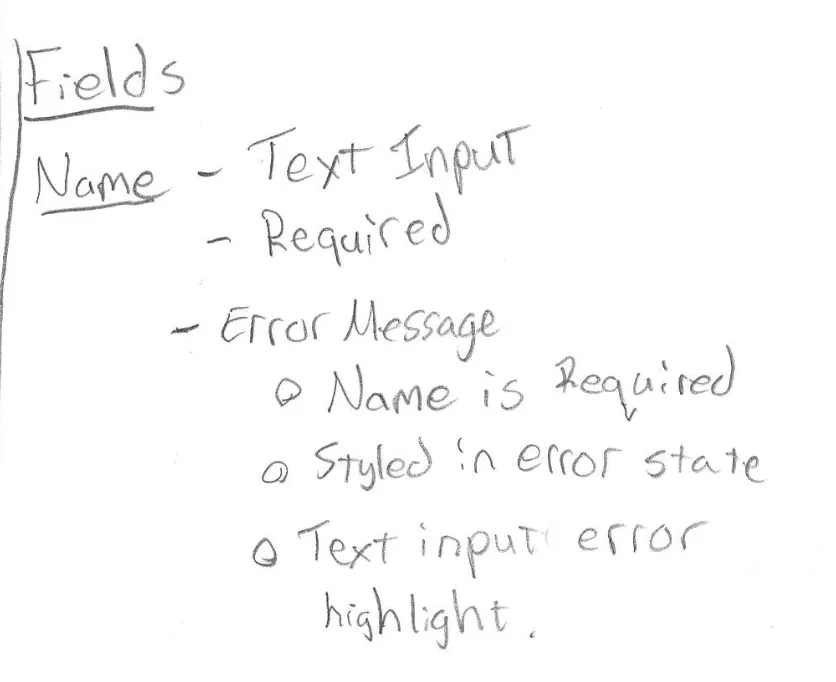
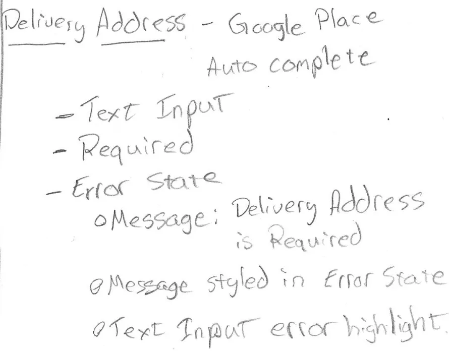
During this phase, I reviewed the form and marked inputs with validations that followed the requirements. For example, the delivery address should be required; an error message will show under the input if the user does not supply one. Additionally, there would be markings to let the user know there was a problem with their input. While the input was invalid, it would not allow the user to move to the next step of the form.
 |  |
|---|---|
| Name field with validation notes | Delivery address with google autocomplete |
Results
The project ended with sketches, but I had a lot of information and considerations, so it was ready for Figma screen mocks. The project lasted two weeks, so by not moving straight to Figma screen mocks, I could spend more time thinking about error states and users being able to cancel and bail on the form.
Lessons Learned
- Upload controls are everywhere, but they are complex
- As a developer, I appreciate thinking about error states this early in the design phase
- Pencil and paper are valuable tools for UX Designers